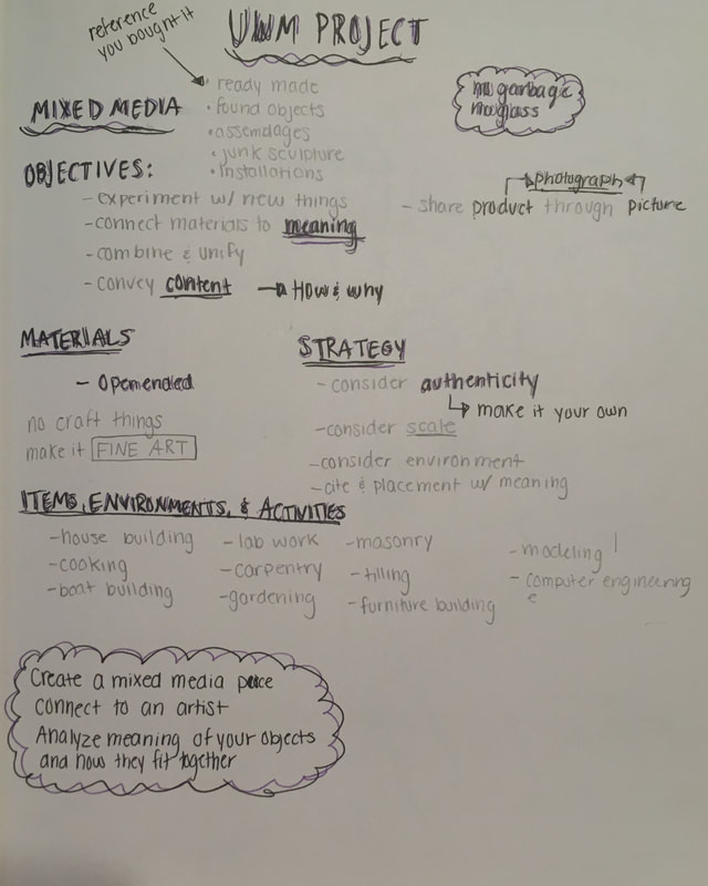
Mixed Media
|
|
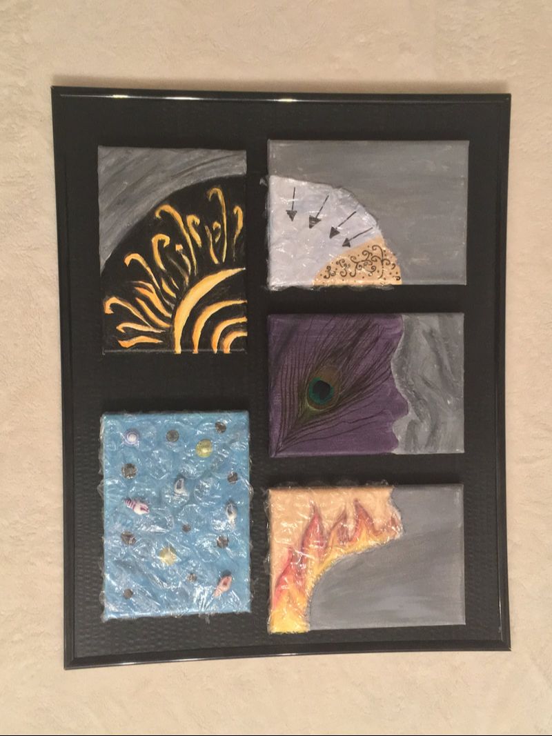
Title: Protection
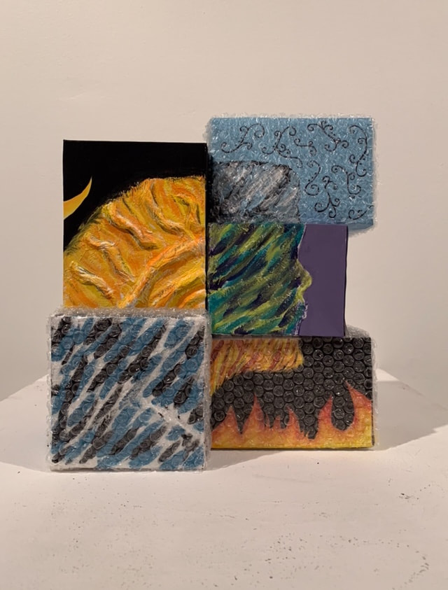
Size: 30 x 29 x 18 cm Medium: Acrylic on poster board, hot glue, Mod Podge, bubble wrap, peacock feather, tissue, seashells Completion: January 2019 |
Exhibition Text
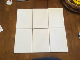
Protection was created to represent how there are certain aspects of someone's personality that they keep protected, while others are more communicated and accepted. Each canvas represents a different aspect of someone's personality. The sections that are wrapped in bubble wrap represent those aspects that someone wants to keep to themselves, like shyness and anger. There are also other aspects that are represented, like happiness and purity. As shown in the canvas with popped bubbles, there are also aspects that have been brought out from within someone's protectiveness. I was inspired by Get Into the Picture by the Mount Mary community, the Chuck Close style of art, and Truly Design's Vanitas.
Planning
Inspiration

|
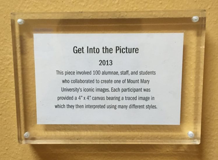
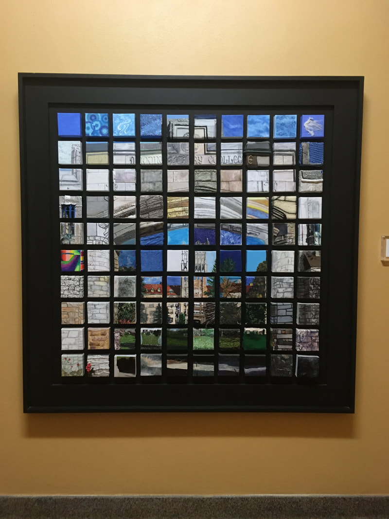
Recently, I went on a tour of Mount Mary University, and when we were in one of the galleries, I noticed this piece. Get Into the Picture was created by 100 alumni and staff from Mount Mary, who were asked to paint a section of the picture in any way they wanted. The original image was grid out, and each of the people were given a square. When all of the pieces were put together in the end, it created this image of being a unified body through individual pieces, which is the idea that carries over into my piece as well.
|
|
My other inspiration for this piece was the style of Chuck Close. I had no intention to do exactly as Chuck Close did in his grid method paintings, but his ideas about how he thought art should be interpreted mirrored the meaning of my piece.
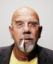
Chuck Close's art was inspired by pop artists, and was famous for his incredibly detailed portraits and grid method technique. In his early work, he used an airbrush technique to create his paintings, but in his later life after he was paralyzed, he switched to the famous grid method technique. This paralysis prevented him from creating those little details in his portraits that he was once famous for, so he adapted his style to suit his physical abilities. In this grid method technique, Close filled each square with splotches of color that, when you step back, creates a whole painting that blends together abstractly |

Chuck Close
|
I really wanted to focus on his style of art, as he explained about his early art that he didn't feel it necessary to show the person's entire life story, about where they work and where they live, but to rather "force us to think, not about the subjects but about the image itself-how and why it was made". I really liked how Close explained his style, and, as said before, it mirrors the message I wanted to send through my own piece.
|
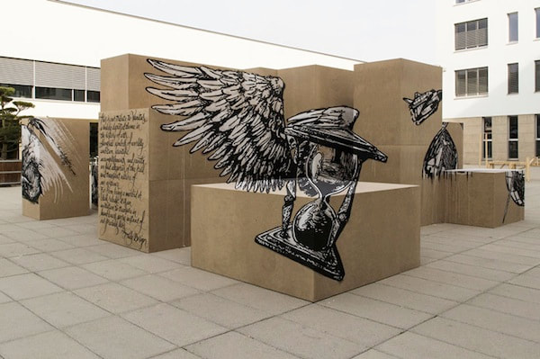
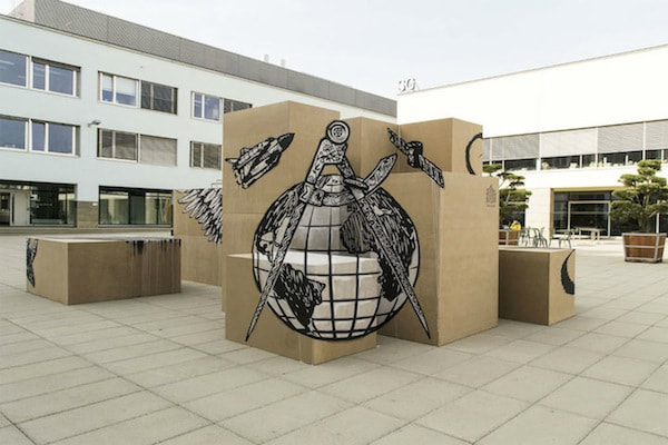
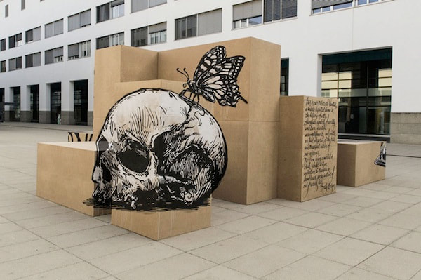
Truly Design. “Vanitas.” Design Taxi, 18 Sept. 2014, Polytechnic Federal School of Lausanne, designtaxi.com/news/369404/Optical-Illusion-Street-Art-Painted-On-The-Sides-Of-Stacked-Cardboard-Boxes/.
|
After the critique, I researched more artists with the three dimensional aspect to them, and came across this piece of optical illusion art created by Truly Design. I really liked this piece because like my original design, it incorporated the idea of putting multiple things together to create a whole, as shown by the optical illusion.
|
Sketches
|
|
|
|
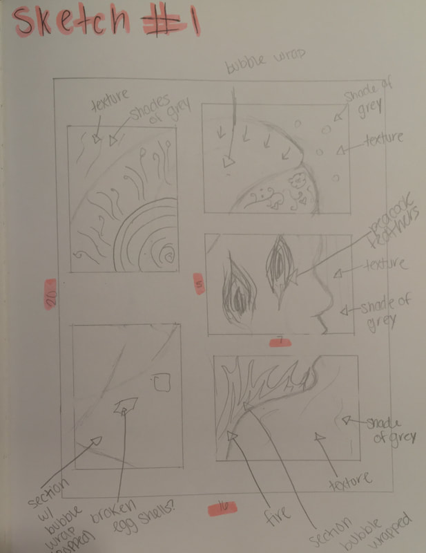
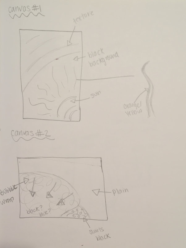
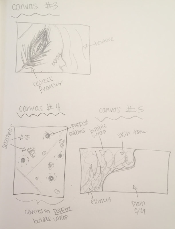
These were my sketches that I referenced when I was creating my piece. When I was planning out these sketches, I split the canvases up as well so I could see them in more detail
|
|
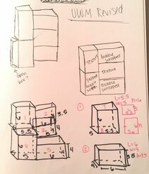
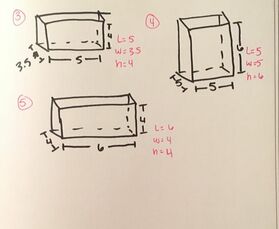
After a critique, I also made this sketch to figure out the sizes of the boxes I was going to make.
Experimentation
My experimentation consisted of me trying to figure out how to incorporate different mediums in the piece. My first thought for this piece was that instead of using seashells, I would use broken egg shells, to symbolize someone breaking out of their shells in a more literal way, but as I was experimenting with it, I found that the egg shells were too delicate, and didn't stay on the canvas how I wanted them to.
|
At first, I used canvases to paint on, but after the UWM critique, I found that I needed my piece to have a more 3D form, so I switched to painting on boxes.
After I made the boxes, I really had to think about how I could translate my original designs onto the 3D surface. After experimentation and sketching, I decided to paint more of the intricate detail on the outside of the silhouette so that the whole box could be covered. |
Process
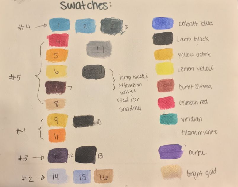
Swatches
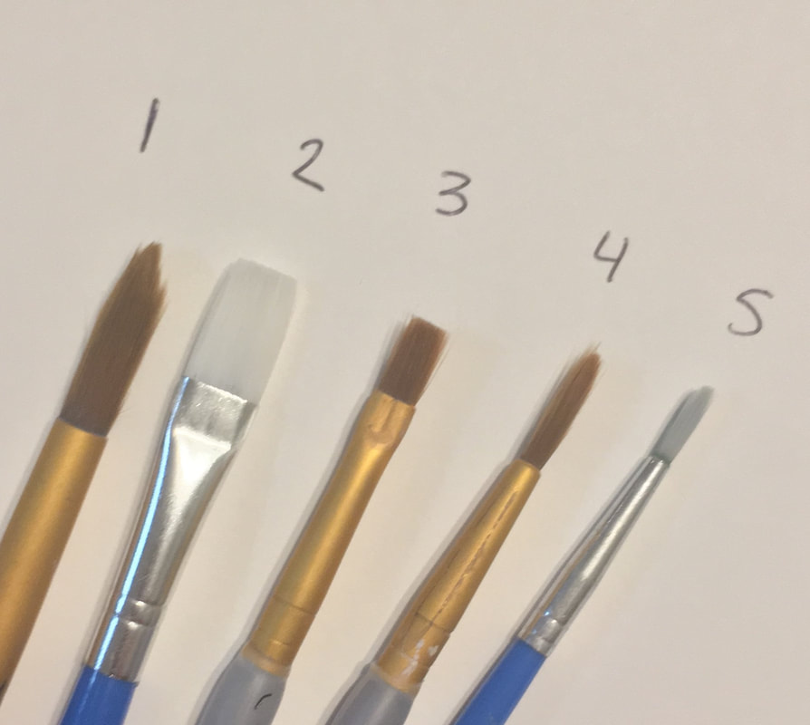
Brushes
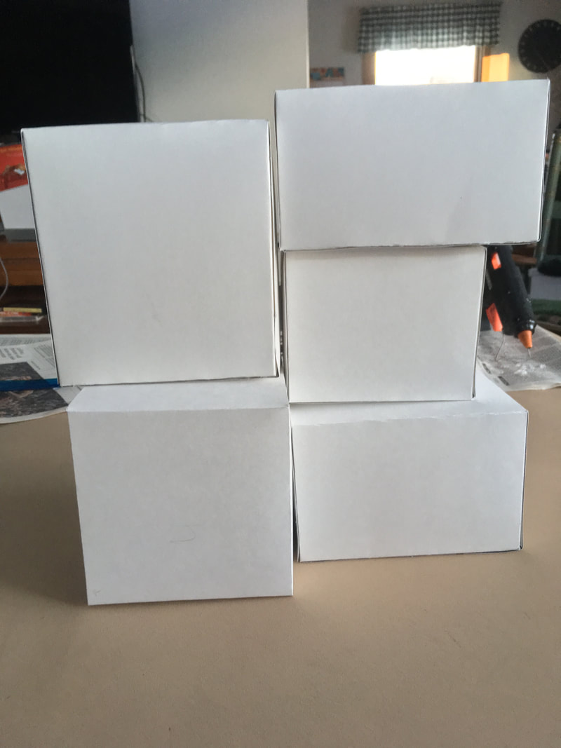
To make things easier for me to plan out, I numbered each canvas to keep myself organized. Then, I made them in order.
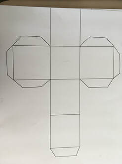
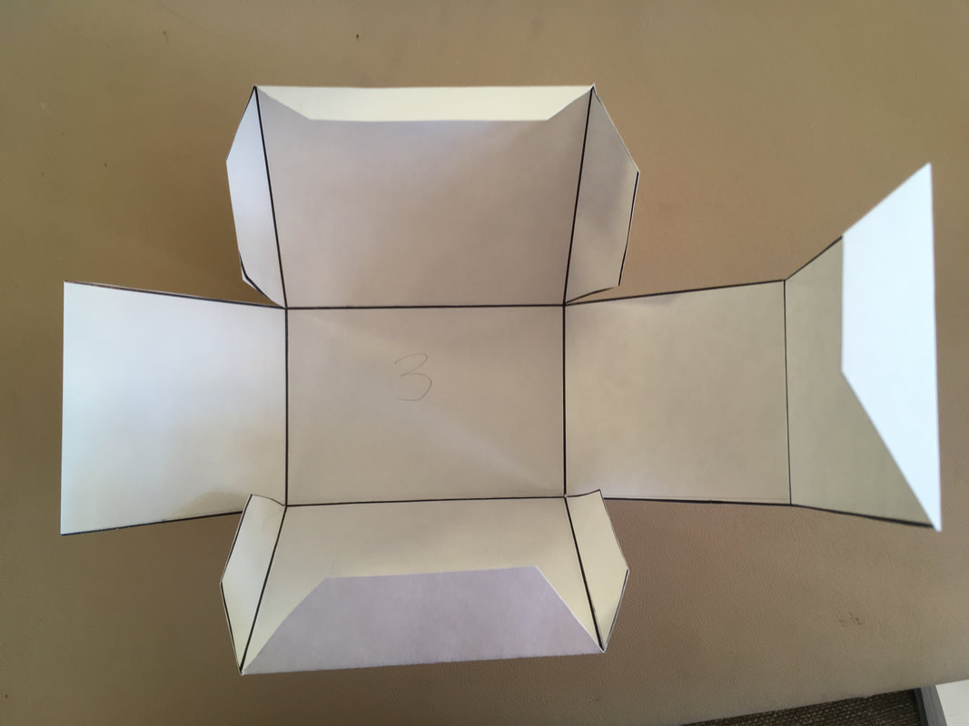
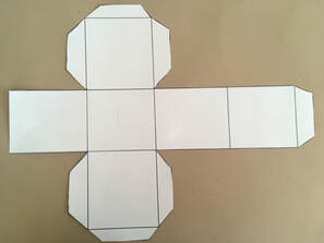
First, however, I had to create the boxes out of poster board.
|
To do this, I first sketched them out, then cut them and folded them to create each shape I wanted
|
|
|
|
|
{Box1} |
|
|
Final Box 1
|
|
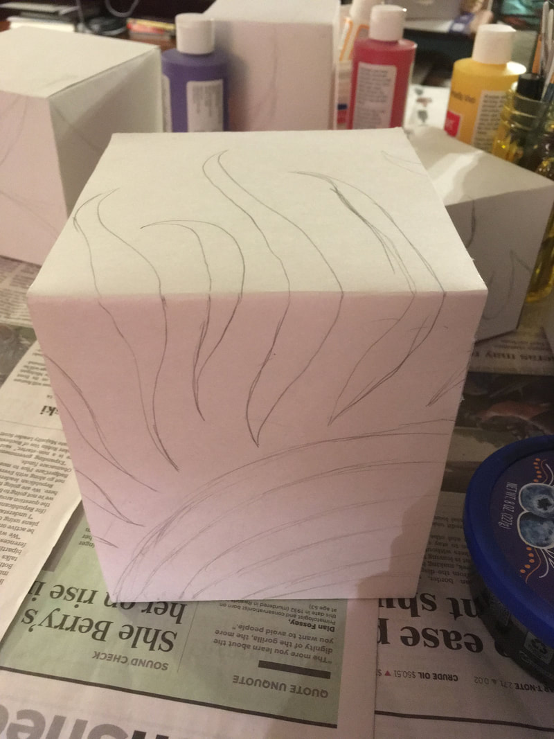
1. Referencing my sketch with kind of a grid method technique, I drew out the design on the canvas
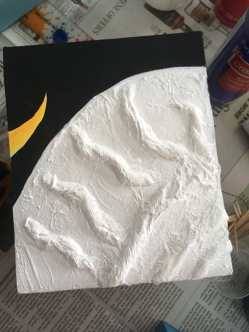
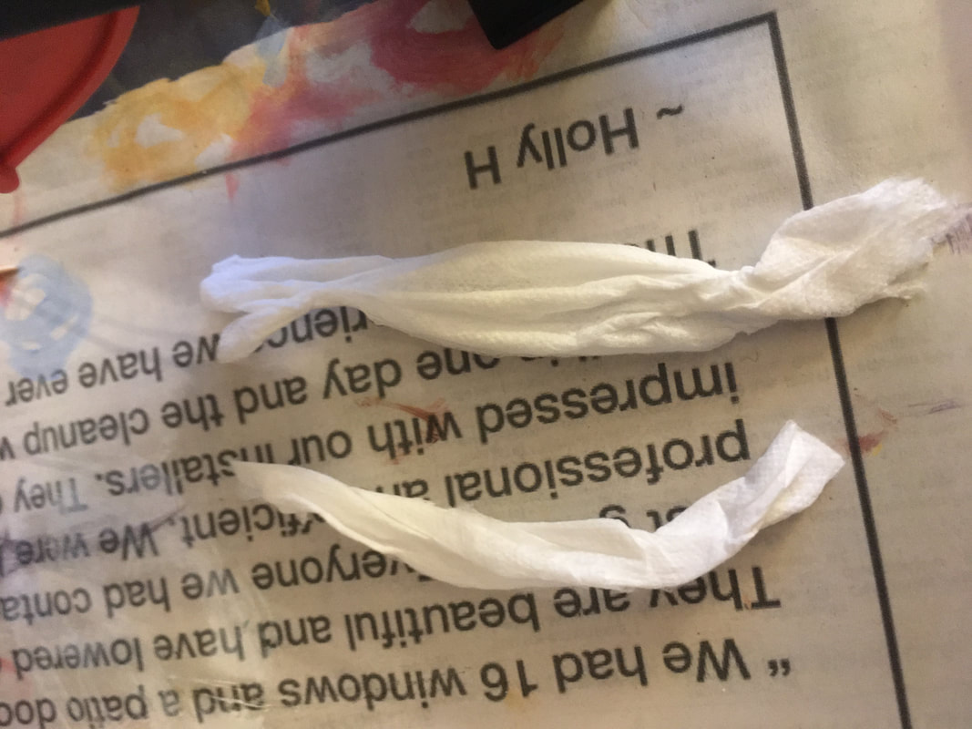
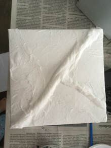
2. Then, I took shade 9 and did a wash of the design with brush 5 3. Then, since the color was pretty sheer, I went over it again once it was dry 4. Then, I went in with color 10 and filled in the background around the design with brush 3 5. After that, I went back in with shade 9 and enhanced the color, as well as shade 11 to add more dimension 6. For the sun inside the silhouette, I took ripped up tissues and made a thin coil, and then hot glued the strips of tissue to the canvas. 7. Then, I took more tissues and covered the coils of tissue so that it blended in better with the canvas. I stuck it on with Mod Podge. 8. Finally, I painted the background of the canvas color lamp black with brush 2
|
First sketch
Creating Texture
|
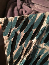
{Box 2} |
Final Box 2
|
|
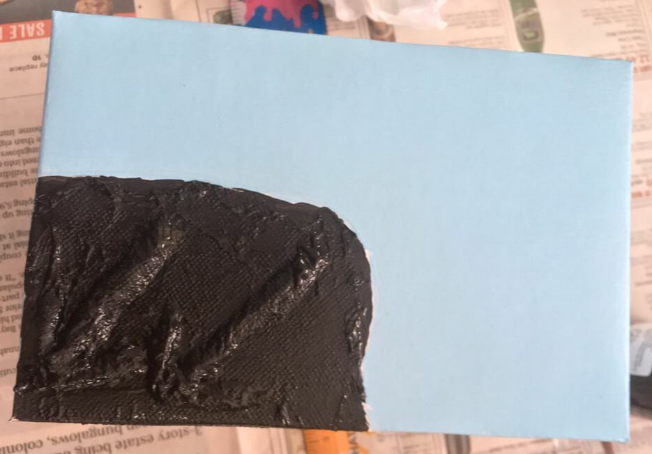
1. I sketched out the design onto my canvas like before
2. Then, I took color 14 and painted the the background with brush 2 3. Then, using the technique above, I added texture to the silhouette 4. I took lamp black and filled in the silhouette part 5. Then, I took color 14 and titanium white to make the little line work 6. Then, with black paint and brush 5, I carefully outlined the swirly designs that were drawn out 7. After that, I cut a square of bubble wrap and hot glued it to the surface of the box |
|
Detail of texture
{Box 3} |
Final Box 3
|

|
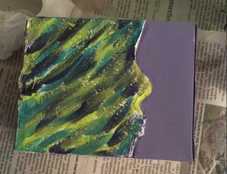
1. I sketched out the design onto my canvas like before
2. I painted the background of the box with color 12 with brush 2 and shaded the outline of the hair in the top left corner with color 13 with brush 4 3. Then, I mod podged the peacock feather to the middle of the back of the box 4. I followed the same steps for the coiled tissue as on canvas 1 to create texture to the silhouette part 5. Then, I took colors that were similar to those on the peacock feather and made the line pattern on the silhouette |
|
Coiled Tissue
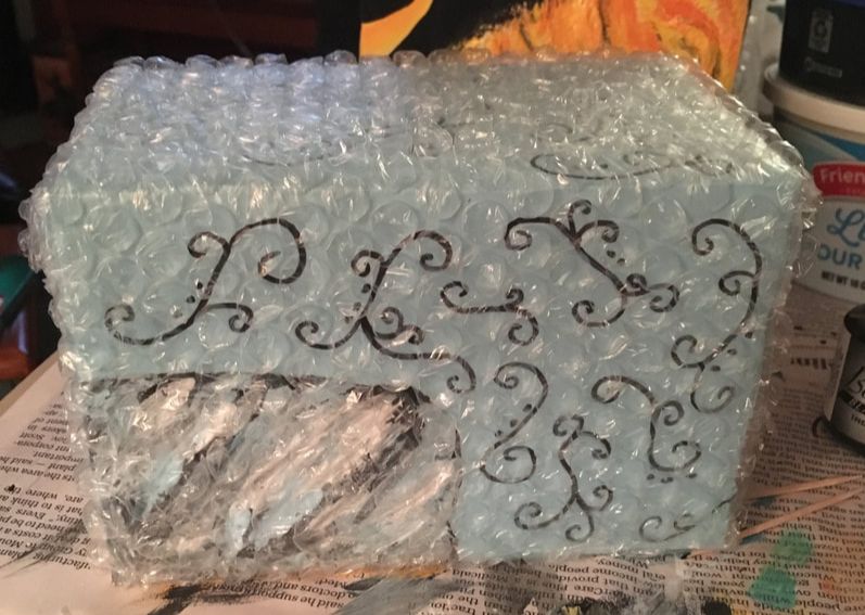
{Box 4} |
Final Box 4
|
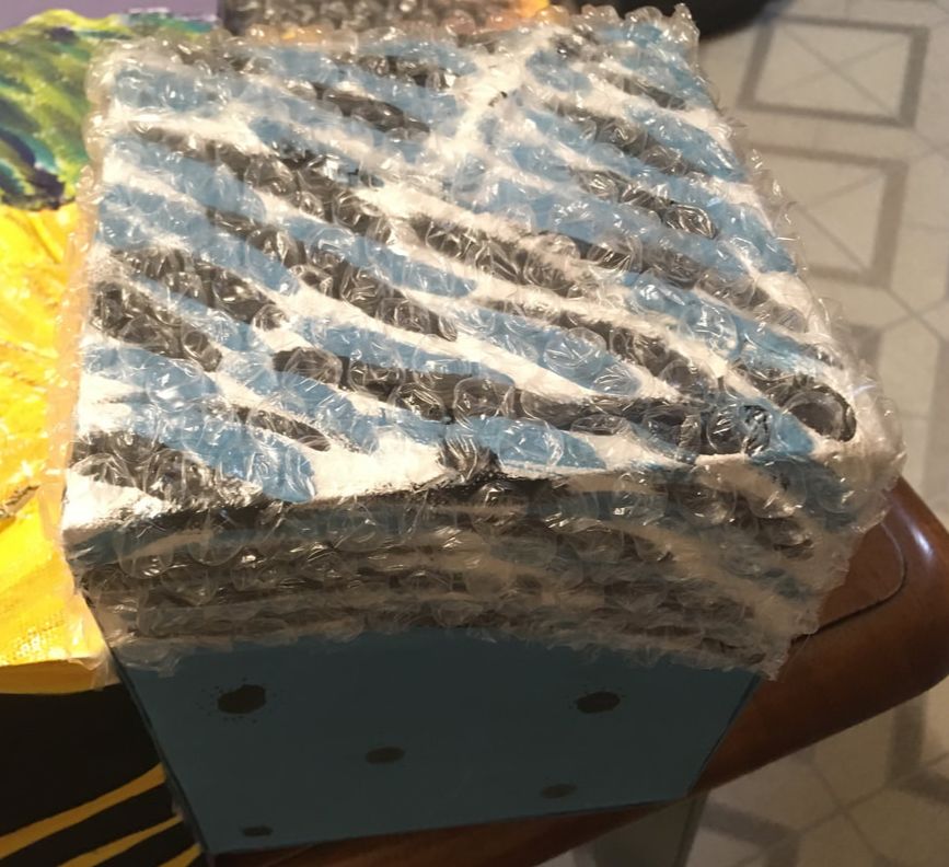
Detail of bubbles
Detail of texture
|
1. I sketched out the design onto my canvas like before
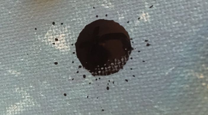
2. I painted the entire canvas with color 2 with brush 2 3. Then, I created texture to the part of the silhouette using the same technique. 4. Then, I created the popped bubble effect on the canvas by taking a bubble of Dr. Ph Martin's Bombay Black India Ink and putting it on the canvas, and then popping it with the end of a paintbrush 5. Then, I covered only the part of the silhouette with the bubble wrap. |
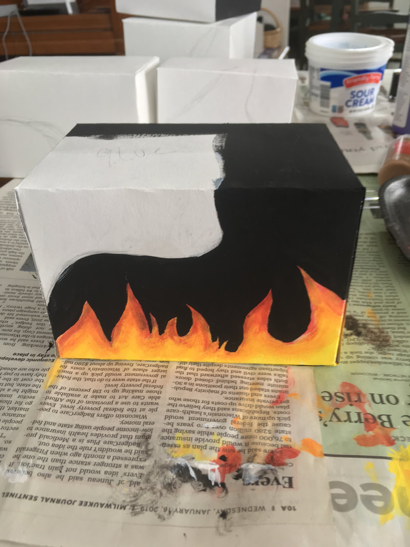
{Box 5} |
Final Box 5
|
|
1. I sketched out the design onto my canvas like all of the other canvases
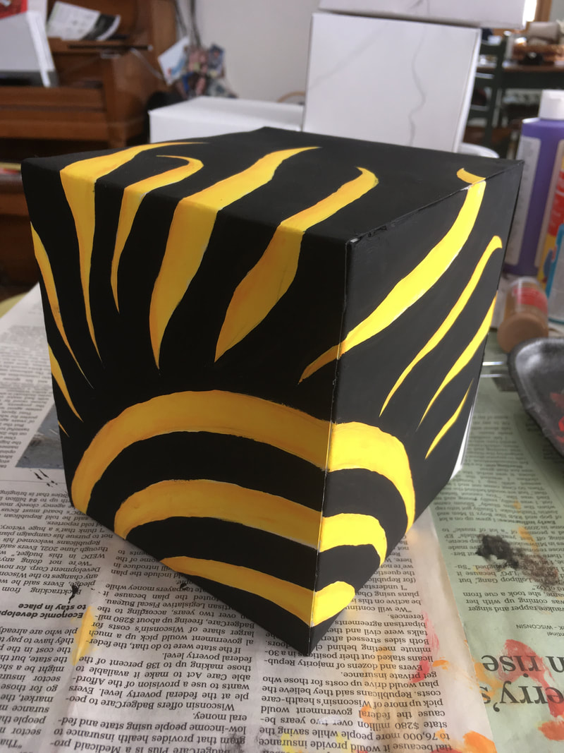
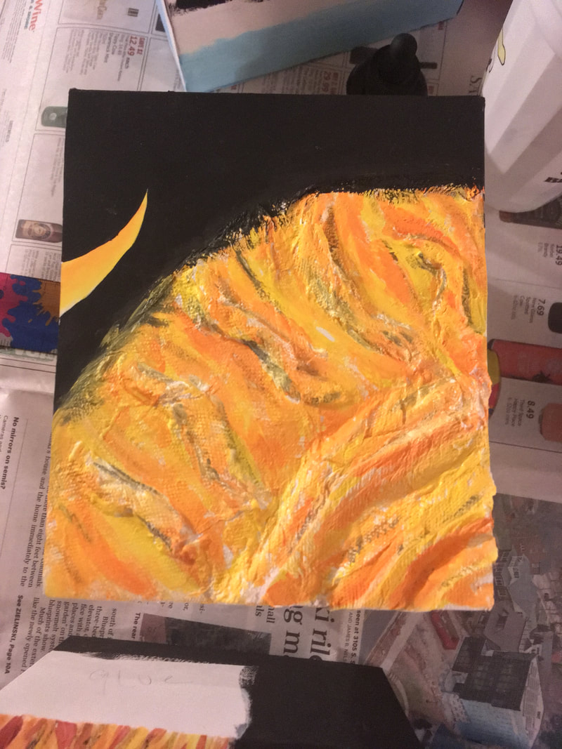
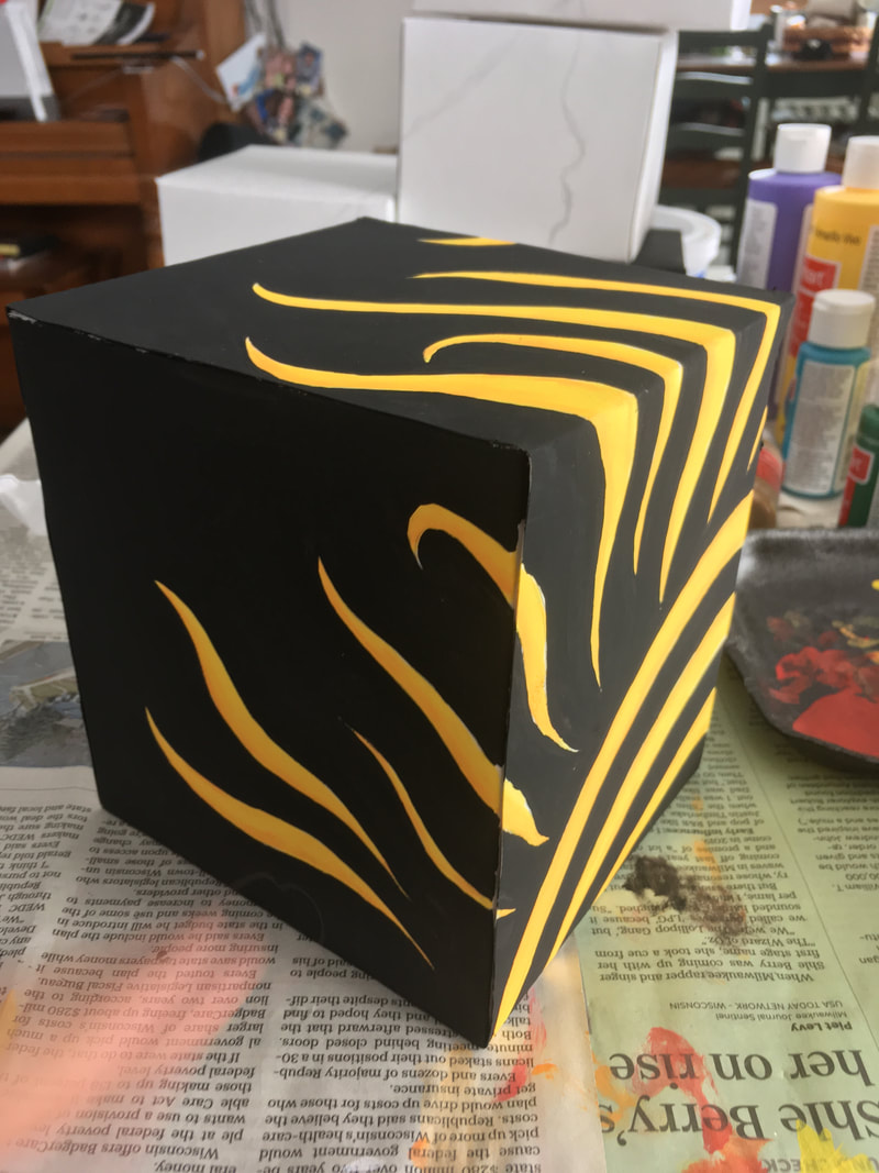
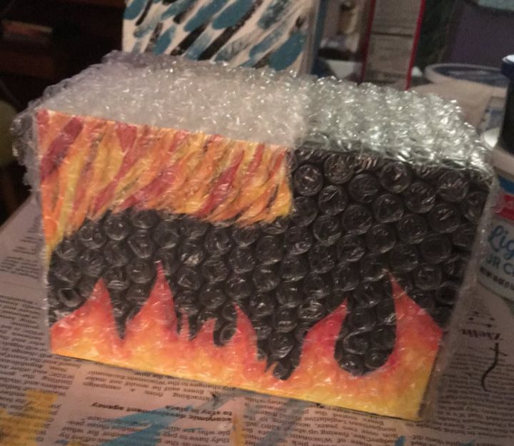
2. To create the flames, I started off with color 6 and made a wash, and repeated that with colors 5 and 4. Then, I blended all three of the colors together using brush 3 3. Then, I took color 7 to add more dimension to the darker colors using more of a dry-brush technique 4. Then, I used lamp black to fill in the areas around the flame to make it stand out. 5. I used the same colors as I did to paint the flames to do the same line technique inside of the silhouette. 6. To finish it off, I covered the surface of the box in bubble wrap. 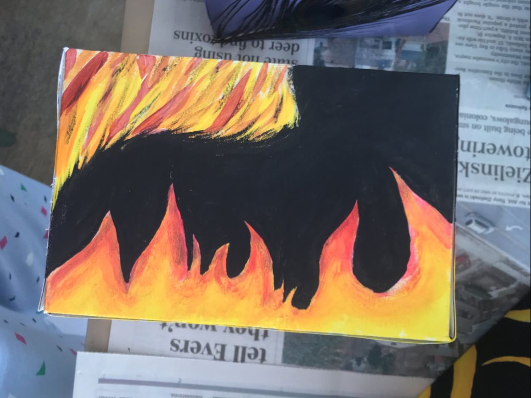
Adding detail to face
|
{Final touches}
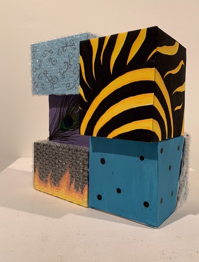
To finish the piece, I put all of the boxes together and hot glued them together.
Reflection
Critique
|
Overall, I really like how the final product turned out. Before the critique with UWM, I thought I had a really solid piece, but after, I got some really helpful tips that I think really changed it and made it better. The alterations I made took me a lot longer to do than the original product, because I had to take into consideration the three dimensional form, but I am really proud of how it turned out. One of the big things that made a difference was the surface I was painting on. The canvases that I was working on originally made the paint blend weirdly because they were not as opaque as I had wanted them to be, but the smooth boxes that I made really helped with how the paint went down. I think overall, I really like the piece as a whole, and I think it portrays the message I wanted it to if you look it it closely, however there are canvases that I like more than others. I do like certain boxes more than others, however. I really liked how box 1 and 5 turned out because I really like the contrast of the bright colors against the black. Like the original, I think that canvas 4 was my least favorite out of all of them because even though it portrays a very important message, I think I could have illustrated it better. The hardest part of the project was getting the textures on the silhouettes because it took a long time. If I were to do the project again, I actually think that I would have never done the texture. Even though I like how it adds more texture, the tissue I had to cover it with to make it blend in with the background made the paint I put on top of it more splotchy. This really shows when you contrast box 5 and box 4. In box 5, the small lines of paint were smooth, but on box 4, there were a lot places where the paint did not go on smoothly. In the end, though, I am really proud of how it turned out, and I hope that people who see it can find the meaning behind it, because it makes all the difference when looking at it.
|
Compare and Contrast
Protection by Lexie Snyder

|
Similarities:
Differences:
|
Chuck Close
Get Into the Picture
|
ACT Responses
- Clearly explain how you are able to identify the cause effect relationship between your inspiration and its effect on your artwork?
- Multiple boxes were used in both Protection and Vanitas, as well as the idea of separate things together creating a whole.
- What is the overall approach the author has regarding the topic of your inspiration?
- The author believes that everyone had certain parts about themselves that they don't want people to see, so they keep that protected from people.
- What kind of generalizations and conclusions have you discovered about people, ideas, culture, etc. while you researched your inspiration?
- We all have things that we don't show people, and that's okay, but there are going to be parts of us that will eventually be exposed to the rest of the world
- What is the central idea or theme around your inspirational research?
- The central theme around my inspirational research was that parts will make up a whole.
- What kind of inferences did you make while reading your research?
- I could infer that smaller parts of something together will most likely always make up a whole, as both of my inspirations were about being greater together.
Bibliography
“Chuck Close.” Pace Gallery, 2007, www.pacegallery.com/artists/80/chuck-close.
Truly Design. “Vanitas.” Design Taxi, 18 Sept. 2014, Polytechnic Federal School of Lausanne, designtaxi.com/news/369404/Optical-Illusion-Street-Art-Painted-On-The-Sides-Of-Stacked-Cardboard-Boxes/.
Truly Design. “Vanitas.” Design Taxi, 18 Sept. 2014, Polytechnic Federal School of Lausanne, designtaxi.com/news/369404/Optical-Illusion-Street-Art-Painted-On-The-Sides-Of-Stacked-Cardboard-Boxes/.
